A great thing to know about Sonova is that all symbols relate to a specified unity-width, so any symbol can (through its width) be thought of as directly and precisely translating to a duration in seconds. The exact relationship will depend on the font size and how much space you allot to a minimum time interval. It can be a little confusing to get one’s head around, but let’s try with an example.
Let’s say that the font size is 12 and decide that a second should take up 4 spaces, then we can make a “time line” like this:
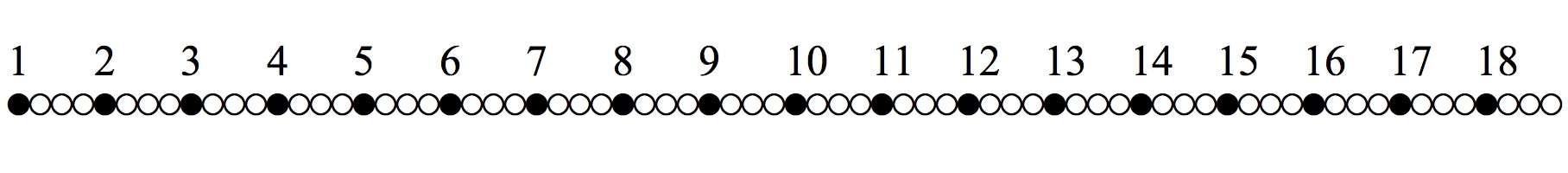 The numbers can be written with Sonova using any natural language Keyboard Layout (such as English U.S.). The principle of a unity-width in Sonova applies to alfa-numeric characters (i.e. letters and numbers) as well. Because of this, using the letters to make words will not look so good, but the letters are excellent if used one-by-one e.g. for indicating sections and motives or making time-lines such as the one above. Then they can be made to always align exactly with the aural sonology symbols.
The unity-width in points is defined to be half of the font size. The normal space character is set to this width, so it is convenient to talk about spaces as the unit of width for Sonova. The “circle” (pitched) symbols in the figure have the same width as a space character. We can see that 4 circles each second would mean each of them corresponds to 0.25 seconds.
When making graphic scores the translation to points or pixels is also of interest. With a font size of 12 points a space will be 6 points. And, if a second is 4 spaces, a second will measure 6×4 = 24 pixels on the screen. Meaning that each pixel will correspond to 0.041666… seconds. Maybe not the easiest number to make addition with, but say you use a font size of 20 points and 5 spaces per second you will end up with a pixel-width corresponding to 20 milliseconds:
1 second / (5 spaces × 20 points / 2)
For precise placement Sonova also has a range of special “spaces”, such as ½-space or ⅟10-space for even greater precision in dealing with timing and placement.
Put in technical terms Sonova is a monospaced, non-kerning Unicode-font. The precision in exact placement this affords, hinges on the text editors ability to handle all this. Microsoft Word for example used to move characters to nearest pixel unless you specifically chose to use “fractional widths”. Fortunately, I have not come across any major problems with placement of the Sonova font in any application I have used the last five years or so.